
spinonym
spinowhat now?
On an ordinary day, while working on a mundane ambigram for a personal project of questionable significance, I somehow unlocked an achievement… with a pretty unremarkable word.
Hello. Welcome back! It has been a while. Appreciate you dropping in.
Recently, I have had the pleasure of creating personal milestone ambigrams, most notably chain ambigrams – and the moment I got the hang of it, the once thought of as an arduous exercise became my second go-to experiment once the basic rotational won’t/don’t work. As exemplified with most of my newer ambigrams are chains.
One that I am very proud of is something I thought I could never come up for a long time is my Aquaman totem ambigram. A totem amb is basically a mirror amb with glyphs stacked on top of each. I never set out to do it as such and it’s obvious with the amount of sketches I produced leading up to the final AHA! moment. What makes my Aquaman totem unique is that it doesn’t really look like an ambigram. You’d think I just typed the characters on a single row and aligned it center… until you get to the “N” where it becomes clear that it’s definitely contrived.
Which leads us here. Another serendipitous creation. A spinonym at that.
A spinonym is an ambigram whose individual characters are flipped and/or rotated and/or skewed and/or inverted instances of a single glyph. In other words it’s the same “letter”.
Example: while the letters W and M could be just inverted versions of each other, the letters E and B (or the number 3) could just similarly be. However, for it to be categorized as a spinonym ambigram, they all could be represented by common glyph, perhaps like McD’s double arches, say for the word “WEB” or “MEW” (or “MEW3” if you are into evolving Pokemons).
As stated above, I was developing a thematically unrelated ambigram. The word was “games”. I was doing it directly on the PC referencing a minimalist sketch with the intent of arriving with a minimalist final art.
I have done a few G/S flips which while doable, sometimes could be tricky. The A/E flip on the other hand was relatively an easier task.
But wait, let me go on a tangent first, this is relevant to my process. Thanks. When I do types, I will most likely duplicate, chop off an reuse parts and instances of a glyph I find both pleasing and crucial to the final character design. It’s usually the letter “I” but could be any other that’ll be the foundation for all succeeding glyphs. This accelerates the design process and make the final design uniform. I do the same for my ambigrams.
So, after I ended up with a G/S glyph to my liking, I made a duplicate to be tinkered with. I flipped the “G” horizontally in preparation for the A/E glyph deciding to work on the “E” face first. The AHA! was immediate. Didn’t even have to chop anything off. I excitedly moved a few nodes in place and there it was. All it needed now was the “M”.
Shorter tangent: I had previously created a monoweight ambigram piece called “HUMAN”, so coming in I knew I’d be doing the “M” in a similar fashion, just three vertical lines with the middle shortened.
Done! Now I was only looking for stray nodes when another AHA! came. Was I that slow? Haha!
I again created an instance of the A/E glyph, reworked it a bit and arranged them to form: SAGE. No AGES. wait let me add…
Ladies and Gents, SAGES, my first spinonym.

Since, it was intended for a different word, I think the character design is a bit off for this specific word configuration, but it’s perfect for “games”.
While I’m glad I got another amb type for my folio, it’s the process of creation that got me most excited – even if it’s by accident. And that is why I’m going to try and purposefully design a spinonym with a character design befitting the word in the coming days.
one flashy ambigram
Because the previous issue was practically just a reprint of an old write-up, I’m putting up this second post for this month. And it’s one flashy ambigram.
This one is has been gathering digital dust for over a year now. I cannot recall which came first, this one or my “Big Bang” piece, but you can see that I have similarly utilized the B/G flip. Just as much, I don’t remember what inspired me to create this, or what was the lead up to it, but I recall being excited after having figured out out the LI/N solution more than the B/G.

I love how whimsical this ambigram look, beginning with the letterform right down to the inlaid mesh – which took me a damn long time to get just the way I like it!
Unfortunately, that’s all I have to say about the piece… I love it, I damn like looking at it but other than that I got nothing!
So see you next issue, then!
the nice and ineffable ambigram of
You could say that this is one of those ambigrams that I’ve been trying to design for sometime where the solution has been staring back at me for just as long.
Stubbornly trying to create a straight up rotational ambigram, only recently did I realize that by making a convincing ligature for the glyph that would be in place of the “O” which in turn leads up to the “S’s” beak, I could create a decent chain ambigram. Just enough not to make it too different from the two other Os of the typeface I chose to emulate, nor getting too far off with the play on the angel/demon symbols.
This is my take on Gaiman and Pratchett’s successful collaboration. I have always enjoyed Gaiman’s work and Sandman was my gateway drug. If you navigate back to issue 52 of this blog, you may see my ambigrammic take on it along with other DC Comics properties.
Each glyph with this configuration is the most natural looking so I settled on it, with only the O/S flip really to contend with. As with other ambigrams I do, there is another version that looks totally different typeface-wise. This one is more of a Blackletter type that although was second to be created was an easier exercise. However, I thought that this final version was easier to read.

And here below is the B/W version of the final ambigram, laid over the one of the original sketches.

As a bonus, here’s the other version as a case study.

While the “M E N” glyphs are legible and the forms are very consistent, the others seems too obscure even when I tweak either the height or the weight (thickness). Also I find the O/S flip weak as compared to the final version.
A little housekeeping before we go. This feature preempted a throwback posting of a design I submitted to a head to head ambigram-off called QuickDraw on a now unfortunately closed website. I’ll go to specifics by then and it’s probably going to be put up next month unless…
It’s an old piece and pretty rough around the edges but we’ll get to my personal progression.
Anyways, to tie things back to this post, I’m still trying to complete the “Endless” series of ambigrams that I was finally able to initiate with the “Sandman/Morpheus” symbiotogram (see issue 52). Here’s hoping I could put it up before the year’s end.
Oh, and by the way, the wing elements I used on the background were downloaded from https://www.uihere.com/ and guess what? They’re free! The texture is mine, though.
komiks 3: zuma
Created by Jim Fernandez in the ’70s, this demigod is the spawn of the Aztec serpent god Kukulkan. This bald, green hulk of a monster’s most prominent features are the two constrictors protruding (about a couple of feet) from either side of his shoulders.
Regarded more as a villain, he enjoyed a considerably extensive publication that has spun off a couple of series in its heyday, was adapted into films, and had its revival in print a few years back.
When I first featured the “Darna/Narda” symbiotogram, I never thought I’d get to make a follow-up issue, much more a third! I’m glad that should this be the last Filipino comic character I ambigrammize – (hopefully not), at least I capped it off with a sort-of-trilogy (XD). To think while “Panday” was published first, “Zuma” was conceived earlier – only that I was not satisfied with the first iteration, so it got pushed further back.
This piece was finished last year after a lot of tinkering with the main glyphs and the final image itself, about the same time another ambigram piece (based on a more internationally well known literary classic which will definitely be featured here sometime soon) was done.
Unlike the two previous “Komiks” feature’s isolated overlaid rendering, I decided to set the ambigram as a stone relief, emulating those artifacts found in the famed 16th century Mesoamerican sites.

But, it wouldn’t be much of a series if I don’t set this image on the “Komiks” page background… so here it is.


I’ve also included the progress sketches and final line art, so you could get an idea on how the design evolved from a possible mirror ambigram solution to its current rotational interpretation.
Finally, I’d like to acknowledge a couple of creators whose work I used to enhance mine. Although Pixabay says no attribution is required, yet it’s the least I could do when they’re absolutely free – even for commercial use!
The stone background image is by Peter H while the torn paper is by Sarah Richter, both from Pixabay. Hope the links work.
time flees
Yes, it has been a while.
To make up for the long absence (or at least try to), this feature is a special one. It is called Tempus Fugit.
Finalized in a stylized Blackletter Type, this is not my first remake of an previously created ambigram. But this get to be the first to be showcased. The first iteration of this design, created about five or six years back, was more Script in form, though similarly a chain-type ambigram.
While I was very much happy with my first take on the phrase, it was pretty obvious (to me) that I could improve on it – didn’t know how or what, but I was positive a better version could be done.
After a whole lot of sketches over time, I thought I made a breakthrough last year and fired off my CorelDraw. Took maybe four days shuffling back and forth with Draw and Photoshop to get to what I consider to be the final ambigram.
However I might take the ambigram further by incorporating it with a steampunk sculpture I have been meaning to do – soon as I find a way to punch it out of a metal sheet.
But in the mean time, we’ll just have to make do with a vector file.
Along with a photograph of the original ambigram in a real world application made in 2014, please be amused by my #taketwo on Tempus Fugit.


aking kulay, aking lahi
#suliktad #danadonajr #imagefoundry

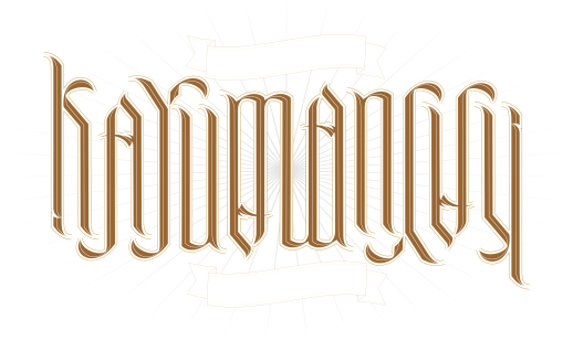
Could not really find time to write a full essay for this suliktad as I had been busy with my workload for the past weeks. And the coming weeks will prove to be just as crammed (although I have a full week of Eid Al Adha vacation) as I fortunately landed a couple of design jobs that’ll need my full attention.
I made two ambigram versions of the word KAYUMANGGI. While fairly similar in construction, the first one is sort of a script/brush type rendering of the ambigram and the second iteration is more of a serif type. These two, however, are recent versions- a remake if you will… after a thoughtful “autocritique” on the merits of the earlier version’s form.
Kayumanggi is a word that both refer to the Malay skin tone and to the Filipino as a race. However, the use of the Spanish moreno in the vernacular in reference to our skin color elevated the word kayumanggi to a regal descriptive word for the Filipino ethnicity.
So, I proudly celebrate the Filipino (with its faults, flaws, misgivings and imperfections) with the suliktad, Kayumanggi.
in the beginning…
UPDATE! (11 July 2019)
The website http://ambigr.am hosted one of its ongoing monthly ambigram competition – this one themed “beginnings”, and the Graces smiled upon my entry: BIG BANG, this very ambigram featured here! Well, thanks to everyone involved for the honor. Do look the site up for some wonderful ambigrams created by some very talented designers. Cheers!
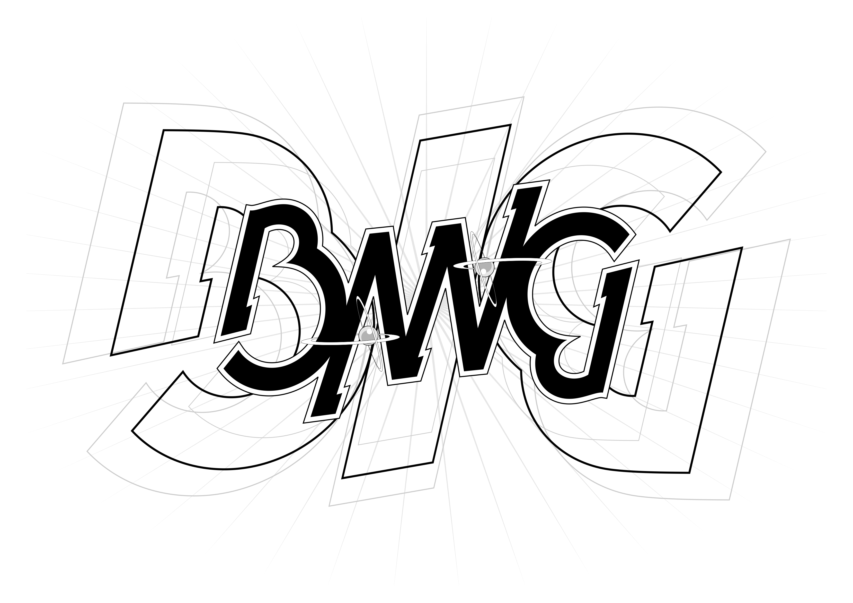
With a mental picture of the word “BANG” in ambigram, I initially thought there was no reason to see it through especially without an exclamation mark to cap it. But the character type style I had in mind was a break away from the usual Blackletter type or the mixed Formal/Serif type I do, that I had to see if it’s actually doable. It’s almost a cross between Geometric type Sanserif and a Slab Serif, a very rare ambigram style, at least in my folio.
Anyway, with an almost finished form of the word done in CorelDraw, It just presented itself to me. Like having two particles colliding then creating all sorts of sparks and light inside my head. BIG BANG. The “B” and the “G” was already there and all I needed was a natural ambigram character… the “I”. But I thought it would even be better if I set the type in a heavier weight – very apt for the word I was going for… and have the word “Bang” lay over it (and I’m all about layers!)
I had no intention of providing a crossbar for the “A”, which I thought in this case would make the “N” less recognizable, but as it stands the form could also be read as “N-V, I-W or M-I”, so I know I had to do something other than the usual “safe trick” of a small glyph between the legs (that usually works with Blackletters and Serifs) as on the onset I knew it would not go well with the type style I had set the ambigram in.
Taking full in, what now had become a new concept, I cheated. I went to my unpublished work (for Ambiverse2) and reinterpreted the atom illustration that I used for a similar purpose. And I think it fits well here. Serving both as the “A” crossbar and an appropriate illustrative element (no pun intended).
Add a couple more instances of “BIG” in different sizes to simulate or suggest radial motion and a starburst behind… voila! The beginning of a new universe.
This piece debuted a couple of months back on the wall of the Fellow Ambigrammist Facebook page.
Trivia
While Edwin Hubble was first to observe the expanding universe, it was actually Georges Lemaitre who proposed the hypothesis we now call The Big Bang Theory (not the sitcom) built upon Albert Einstein’s General Relativity. He was an astronomer, mathematician, physics professor… and an ordained priest, Jesuit, I think.
It was said that Einstein brushed this theory off initially because it did not conform to his (Einstein’s) static universe belief, but almost immediately after Hubble’s discovery was published, Einstein openly endorsed Lemaitre’s hypothesis. Einstein then denounced his own “cosmological constant” modifications on his equations allegedly referring to it as his “greatest blunder”… which, as it now turns out, astronomers believe could possibly explain the theoretical Dark Energy… but that’s another story.
Got that from watching a whole lot of Carl Sagan, Neil deGrasse Tyson etal Youtube videos and BBC docus.
**********************************************************************
#danadonajr #ambigram #imagefoundry
my portfolio

FanFic, anyone?

Chapter 52, page 624
