
one flashy ambigram
Because the previous issue was practically just a reprint of an old write-up, I’m putting up this second post for this month. And it’s one flashy ambigram.
This one is has been gathering digital dust for over a year now. I cannot recall which came first, this one or my “Big Bang” piece, but you can see that I have similarly utilized the B/G flip. Just as much, I don’t remember what inspired me to create this, or what was the lead up to it, but I recall being excited after having figured out out the LI/N solution more than the B/G.

I love how whimsical this ambigram look, beginning with the letterform right down to the inlaid mesh – which took me a damn long time to get just the way I like it!
Unfortunately, that’s all I have to say about the piece… I love it, I damn like looking at it but other than that I got nothing!
So see you next issue, then!
QuickDraw Challenge
After I joined the community of ambigrammists in the now non-extant ambigram.net, I was asked by then moderator(?) Nikita if I’d like to take on a challenge that would be featured on one of the recurring segments of the website called QuickDraw.
It usually feature two ambigrammists taking on a soon to be revealed word, and would have a week or two to come up with a solution and a short description of the process. The other artist I was paired with (or against) was Bill Sterigoudis, who arrived with, interestingly enough, a similar solution.
Daunting to a noob who wanted to leave a good impression – especially after debuting a 1st runner-up piece to a then recently concluded contest – I agreed!
Below are both the pieces and the narrative it came with. Re-reading the text, I don’t know what on Earth I was talking about – which could (or not) be attributed to an evolution of sort of my ambigram making process.
**********
Since this is my first QD Challenge, I was surprised to get a fairly simple word… NOT.
This turned out to be very challenging since I wanted to veer off from my usual font-styling.
However, in my experience a word or phrase and its letter correlation pretty much dictate the font style.
After deciding to do a rotational ambigram, I first did my letter correlation to see which letter match with which.
Then come in the sketches. I’m a very rough sketcher which tends to be a problem when digitally tracing the lines, but i’m used to it.

I set out to try and do an ambigram with intertwining letter parts, but if it’s not doable – I have in mind a simpler design.
The challenge here, I found, was the “a” and the “g-t” correlation. although “a” is simple enough, finding an accurate letterform to match the entire font style was tricky. solving the “g-t” problem took me longer than I expected.
I tried using the “r”‘s leg and even styling the “i” dot for the “g”‘s outer bowl. all in all this process yeilded me two font styles: one semi-gothic and the other scriptic.

I usually just do half the ambigram (for convenience, mostly). so i scanned the sketches and imported them to a vector based program for tracing and node editing. after fully re-creating the half-ambigram,
I line it up to see the whole image. then I tweak the ambigram basically to try and improve legibility and/or aesthetics.
After a half-a-dozen semi-gothic design varieties, editing the ambigram with either or both with CorelDraw and/or Photoshop as may be required, commences. I decided to go with a simple design with the Argentine flag as inspiration.
finishing the scriptic style, however, demanded more attention so it would not read “Vargentina” rather a double stemmed capital “a”.


**********
I don’t know if I’d do it the same way were I to try and have a go with it today… probably yes, because looking at it with a “not-a-noob-anymore” eyes, I see a couple of places where I might make it less busy; where I probably overthought it.
Now, since this is basically a “re-upload” (and almost a cheat) I feel compelled to post another ambigram piece. If so, it will be the first time in a while since I posted more than once in a month! I kinda like it. And I think I have a cool piece for it (it’s just that I don’t have a narrative to go with it, hehe). So maybe I will do that by next week, yeah, for sure by next week so be sure to be here then, and thanks for dropping by.
the nice and ineffable ambigram of
You could say that this is one of those ambigrams that I’ve been trying to design for sometime where the solution has been staring back at me for just as long.
Stubbornly trying to create a straight up rotational ambigram, only recently did I realize that by making a convincing ligature for the glyph that would be in place of the “O” which in turn leads up to the “S’s” beak, I could create a decent chain ambigram. Just enough not to make it too different from the two other Os of the typeface I chose to emulate, nor getting too far off with the play on the angel/demon symbols.
This is my take on Gaiman and Pratchett’s successful collaboration. I have always enjoyed Gaiman’s work and Sandman was my gateway drug. If you navigate back to issue 52 of this blog, you may see my ambigrammic take on it along with other DC Comics properties.
Each glyph with this configuration is the most natural looking so I settled on it, with only the O/S flip really to contend with. As with other ambigrams I do, there is another version that looks totally different typeface-wise. This one is more of a Blackletter type that although was second to be created was an easier exercise. However, I thought that this final version was easier to read.

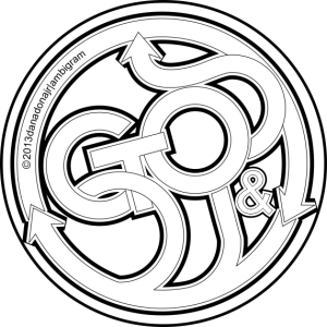
And here below is the B/W version of the final ambigram, laid over the one of the original sketches.

As a bonus, here’s the other version as a case study.

While the “M E N” glyphs are legible and the forms are very consistent, the others seems too obscure even when I tweak either the height or the weight (thickness). Also I find the O/S flip weak as compared to the final version.
A little housekeeping before we go. This feature preempted a throwback posting of a design I submitted to a head to head ambigram-off called QuickDraw on a now unfortunately closed website. I’ll go to specifics by then and it’s probably going to be put up next month unless…
It’s an old piece and pretty rough around the edges but we’ll get to my personal progression.
Anyways, to tie things back to this post, I’m still trying to complete the “Endless” series of ambigrams that I was finally able to initiate with the “Sandman/Morpheus” symbiotogram (see issue 52). Here’s hoping I could put it up before the year’s end.
Oh, and by the way, the wing elements I used on the background were downloaded from https://www.uihere.com/ and guess what? They’re free! The texture is mine, though.
komiks 3: zuma
Created by Jim Fernandez in the ’70s, this demigod is the spawn of the Aztec serpent god Kukulkan. This bald, green hulk of a monster’s most prominent features are the two constrictors protruding (about a couple of feet) from either side of his shoulders.
Regarded more as a villain, he enjoyed a considerably extensive publication that has spun off a couple of series in its heyday, was adapted into films, and had its revival in print a few years back.
When I first featured the “Darna/Narda” symbiotogram, I never thought I’d get to make a follow-up issue, much more a third! I’m glad that should this be the last Filipino comic character I ambigrammize – (hopefully not), at least I capped it off with a sort-of-trilogy (XD). To think while “Panday” was published first, “Zuma” was conceived earlier – only that I was not satisfied with the first iteration, so it got pushed further back.
This piece was finished last year after a lot of tinkering with the main glyphs and the final image itself, about the same time another ambigram piece (based on a more internationally well known literary classic which will definitely be featured here sometime soon) was done.
Unlike the two previous “Komiks” feature’s isolated overlaid rendering, I decided to set the ambigram as a stone relief, emulating those artifacts found in the famed 16th century Mesoamerican sites.

But, it wouldn’t be much of a series if I don’t set this image on the “Komiks” page background… so here it is.


I’ve also included the progress sketches and final line art, so you could get an idea on how the design evolved from a possible mirror ambigram solution to its current rotational interpretation.
Finally, I’d like to acknowledge a couple of creators whose work I used to enhance mine. Although Pixabay says no attribution is required, yet it’s the least I could do when they’re absolutely free – even for commercial use!
The stone background image is by Peter H while the torn paper is by Sarah Richter, both from Pixabay. Hope the links work.
time flees
Yes, it has been a while.
To make up for the long absence (or at least try to), this feature is a special one. It is called Tempus Fugit.
Finalized in a stylized Blackletter Type, this is not my first remake of an previously created ambigram. But this get to be the first to be showcased. The first iteration of this design, created about five or six years back, was more Script in form, though similarly a chain-type ambigram.
While I was very much happy with my first take on the phrase, it was pretty obvious (to me) that I could improve on it – didn’t know how or what, but I was positive a better version could be done.
After a whole lot of sketches over time, I thought I made a breakthrough last year and fired off my CorelDraw. Took maybe four days shuffling back and forth with Draw and Photoshop to get to what I consider to be the final ambigram.
However I might take the ambigram further by incorporating it with a steampunk sculpture I have been meaning to do – soon as I find a way to punch it out of a metal sheet.
But in the mean time, we’ll just have to make do with a vector file.
Along with a photograph of the original ambigram in a real world application made in 2014, please be amused by my #taketwo on Tempus Fugit.


looking back, looking forward and being in the moment
Her’s one ambigram design I thought would aptly help usher in a positive new year.
When I first started the draft for this post, what formed was a short essay on my fascination with time, as it is portrayed in sci-fi series of my youth, peppered in with dashes of trivial sci-facts and musings on concepts like its apparent entanglement with space. I was trying to find ways to lay some ground work to link it with steampunk and time travel that would eventually be unraveled in some future post featuring some connective ambigram themes, but I had to put it off a while as I thought this month’s featured design feels so much removed from the essay – or the other way around.
And then some recent not-so-spectacular event prodded me to go off on a tangent. This new composition I thought was more appro… relevant to the ambigram than the older draft. I have embedded below the recent post from my personal Facebook account from a week back recounting what led to my resolving not just the essay problem but how I was to present the final ambigram as well, if you so care to read up about it. It’s a couple of lines below… somewhere.
The past, the present and the future.
The proper Filipino terminologies of these words are nakaraan (past), kasalukuyan (present) and hinaharap (future). And while the words kahapon, ngayon and bukas could be substituted to convey the same concept, but with more urgency as they are more commonly used vernacular, they respectively translate literally to yesterday, today and tomorrow.
The first to be created of this three-part ambigram was Ngayon. This was in October, last year. I don’t exactly remember what led me to try out the word but what I do remember is immediately recognizing that basing the lettering on Avante Garde or Futura lends to very legibly formed glyphs. Ngayon was a naturally ambigrammable word, and it was created straight up vector with ease. As a side-note: you pronounce the “Ng” (the 16th letter of the Filipino alphabet) of Ngayon as you would the initial “ng” of bringing.

Feeling kinda smug about it, I decided to take on Kahapon and Bukas seeing if I could turn it into a symbiotogram. It.laid.me.wasted. I got totally ahead of myself with a 3-tier stacked word art with Ngayon smack center. The more I forced the issue the more the glyphs became convoluted and illegible. Turns out though that, individually, Kahapon and Bukas could be designed into chains quite nicely. I decided to go old school Blackletter with Kahapon starting off with the “o” as the link, then based the glyphs of Bukas from Bahaus – which kind of have this utilitarian simplicity feel to it – a common futurist theme, working it out from the “S” as the link.


Okay, I could have left it at that. Usually, when doing a circular chain ambigram I would just export the final vector .png file over to Photoshop then apply the Polar Coordinates filter and use whatever was produced on my final presentation. Of late, however, I had been taking an extra step. Some might say. could be achieved, probably far quicker and more efficiently when approached with or through some other means. Anyway, I import the outcome back to CorelDraw, my usual vector editor, and recreate a second iteration based on the newly filtered graphic, which at this point is – by all accounts a raster graphic. This way I’d have a crisp editable vector file of the chain now laid out in a circular pattern. I did this for both Kahapon and Bukas. It’s tedious and probably time consuming but not unnecessary as the practice is well worth it.
Still wanting to stack one word over another to – this time – simulate progression (in time), I decided to fashion them layered as a single piece. I really was – am – happy with the final outcome and I had it set like that, ready for posting intended for this month. With this blog’s 50th issue published last month (December) and out of the way at last, I started experimenting with the finished ambigram in my free time by laying it over different photographic images to see how it’d fare if such a requisite arise.

I went through a series of images from my personal archive and commercial stock. Some were okay but others were trying hard. The one above is from a series of silver lining photographs I had recently taken. Pairing the ambigram with this one seemed appropriate enough, but once I did, it looked dreary and frankly lends nothing to the ambigram and rendered the very image useless and unrecognizable. So I decided to forgo with the idea or at least set it aside and procrastinate until I really had to go through with it. It was after all almost just a whim on my part, as the composite ambigram design seems to be doing just fine by itself.

This one could be used as a steampunk clock face.

Until, a couple of Fridays back…
Okay, technically I could have just re-written or copy-pasted the texts here. But there were two reasons for me embedding the link here and presenting it as such. First (and likely the real reason) was I wanted to see if it would work! Embedding the link, I mean. On the previous post I had successfully embedded a video from my Youtube channel, and this time I wanted to try it out with some other social media platform. And there you go. Second was I wanted to show the image that inspired me – ‘though that really was a non-reason as I can just as easily, and independently, insert the image into the post. Sorry, but not really.
The final piece.

Laying the ambigram over the panorama was done in under a minute. While created at different moments and for different reasons, both elements it seems fit and complemented each other and I liked it a lot. Level completed, Ability unlocked, +1 Life added… press X to resume. It could just be bias, or you know fluffing my own feathers, but to me this final piece became more… poetic, as I currently grasp for a more fitting adjective. As to why – I can’t yet put in words and who cares, right now that is all that matter, to me at least.
And that my friends, was the first post of the year and the 51st, thanks to all who hung around and kept an eye out for this issue. Here’s hoping for a productive year, everybody. Now I’m going to have this printed large fomat and mounted in a wall in my house… just need to find that wall first.
#suliktad #ambigram #danadonajr #imagefoundry
how I make ambigrams
I initially wanted this to be a “How To Make…” write up. But with what I had learned starting from the first time I tried my hand out at ambigramming straight through when I had decided to dedicate this blog mostly to my personal exploration of the artform, was that while – just as with other discipline – ambigramming could be taught, I wondered how will I be able to make a step by step instructional presentation when ambigrams can be created through a number of different methods. So I decided to focus on one, my method. But the thing is – my methodology may only make sense to me and maybe even more difficult to put in words.
After multiple rewrites on the content (wrote the first draft 24 May 2015) – and title changes – I opted to forgo with the instructional format as the tone, voice and language sounded a bit of a put on (and another version that seemed to be a long winded anecdote) and settled with the idea of just flat out sharing my creative process.Personally, I don’t think I am anywhere near the point where I could impose with authority the way I do things anyway.
49 published posts (two were non-ambigram related), over a hundred ambigram designs, 24,373 words as of last count, hundreds of unsorted stack of scrap paper, over 1TB disk space and 4 years later, it all remains to be just a bunch of jumbled up mental post it notes – a mishmash of pointers I remind myself, plus some actual written stuff at the back of virtually every sketch or some notebook to remind me how I came up with certain solutions or what inspired me to do the piece and tips I picked up from other designers and a couple of orphan .doc files. This for the record is my attempt (fourth, actually) to put them all together in one place.
*** sidetrack ***
Yup! 50 posts. And while I never really set out to find readers and followers for this blog (as I just needed a regular outlet and a place to put up my work on so I can force myself to not procrastinate too much), I have managed to get a few likes, a re-blog and 30+ followers with only one of them I personally know, not to forget some very nice people who became clients! I know, 30something in an era where a hundred followers is considered lame, yet for me having even just one person mildly interested enough in what I do already is a biggie!

So, as a gesture of appreciation to everyone kind enough to have followed, liked and all that stuff, AND whoever else stumbled upon this inconsequential parcel of web space, whether intentionally searching for the topic or not, I present a hopefully helpful insight – of which I do not impose on anyone – how I do ambigrams.
First, a couple of caveats…
- I believe there is no right or wrong way to make an ambigram. Whatever works work.
- This is not a “How-to” guide, it’s more of a peek in to my process -pointers I check myself with while I draw my ambigrams.
- The list of tips below are just that – tips. They are not commandments to live by. My process may or may not work with anyone else’s. You may think that my notes here are all bull and that’s fine, go with what you feel will work for you and you’re free to cherry pick.
- Ambigrams, I think, are just the same as optical illusions, or as Neil deGrasse Tyson put it: ‘brain failures’. In concert with the eyes – our complex but somewhat flawed primary organ for observation, our brain is easily tricked by patterns, lines, shapes and forms when seemingly arranged in such a way that titillate our own biases and preconception. Also our brain has evolved to recognize and pick out patterns (especially faces) even and especially in a clutter or among “background noise” the way our precursors saw the zodiac patterns in the night sky, or the faces on toasted bread or sides of a mold laden wall. Therefore, our objective is to try and trick the brain, or exploit that shortcoming, into recognizing a word where that very word was formed not necessarily with its “proper” parts. Where characters and glyphs are setup trying to convince the brain into thinking it is what it appears to be.
- Most of these tips assume that you do intend to push through with this artform and willing go and actually get your hand wet with it. Because like in any discipline you need to work on it, learn as much as you can about it, and dedicate time to honing the craft. A person just don’t go applying a “Y” incision on anybody without first going to med school expecting things to turn out just fine or pick a fight with Conor McGregor on a whim without going through some form of training. Talent can only take you so much.
- It also assumes that we are aiming to craft a proper ambigram. Not even a perfect one, but a proper one.
- Not all words are ambigram friendly.
A Somewhat In Order Unordered List
There are no rules in ambigram making. Well, sort of.
So long as it’s legible, it’s all good. However, a really successful ambigram (as intimated by those better at this than I am) is one that even with all the manipulations applied to it, follows basic typographical fundamentals.
Keep the letterform consistent.
As with making a poster (or most printed materials) try not to mix up types and fonts. It gets too busy and taxing to the reader. Another characteristic of a good ambigram is that it does not seem to be a specially lettered word until after you rotate or flip it. If you began with a Sans Serif type then there shouldn’t be a Blackletter glyph in there unless of course the ‘concept’ calls for it.
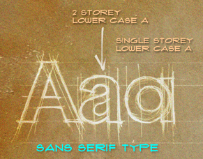
While it is mainly aesthetics I try to keep all forms fairly similar, I try my best not to mix my “double storey a” with “single storey a” on a piece unless there really is no way around it. I have a similar problem with placing caps between lower cases but sometimes you just have to roll with it.
Keep the letterform consistent II.
Or define the ambigram’s personality. This comes in the later stages, usually as I finalize (mostly done digitally) the piece. I take on the most prominent letter and work on it first. It does not need to be the first letter, but the letter that will appear most frequently (especially with Filipino words: the letter A appears with great frequency in Filipino words). Once that letter has been interpreted to my satisfaction, I use its parts in building up the other letters employing as much (or little) modification necessary. This help ease in the reader with the word as they do not need to decipher each letter, since, as seen on the figure below, certain letters appear somewhat similar to its previous incarnate. Similarly looking parts and ligatures lend a consistent personality to the ambigram – as if it was set to a very specific type, the way one would apply a font selection to a regularly typed word on a word processor or a graphic design program.
 Which leads us to… typography.
A little background knowledge on lettering basics IS a big plus.
Back in college I passed LETTERING 101 and 102 by the skin of my Speedball C-tip. I was not an exceptional calligrapher nor letterer, I was average to say the least but I had this knack of retaining useless information that works just as well with useful ones. I am not bookish but I read a lot and pay attention to things I know I should know even after college. Printing is a big part of my profession so I tried to be as much informed as I could in the early days, and typography has got a lot to do with printing. What I had learned then(well mostly), added to my design studio and freelance experience has provided me adequate practical understanding of the basics of typography.
So, empower yourself, know the basics, read up on it, learn the difference between types and spacing… and kerning, and width… and the parts of a type… etc. Like me, you need not be a John Hancock but you have got to be able to know a bit of it since you are basically making word art.
With that I offer a link to a downloadable type cheat sheet that I made for myself at the bottom of the post, with no obligation on your part. It focuses mostly on the anatomy of type – could be helpful in identifying or discerning which part of the type you’re supposed to be manipulating in the construction process of your ambigram. And whodathunk that types have parts and classification, amarite? At the very least it could be useless trivial fodder at boring parties, but you are free to keep it for yourself or share or pass it around if you so wish.
Research. Explore. Exploit.
This is an integral part of any creative undertaking. When I do logos, poster works, album covers and even when preparing for a meal I already know how to make, I do my homework. And this goes also with ambigram designing. Study the word you intend to work on. Include in your study word association and etymology, not just the meaning of it. Better understanding of the word will greatly help you in interpreting and setting it to appropriate type.
If you go over my ambigram work you’ll probably notice that I mostly incorporate or design them around a theme. Call it Conceptual Ambigram… or don’t. Anyway, with the research I had done for the ambigram itself, I am able to plan out an even bigger idea than I started out with. And if done correctly, would inevitable make the ambigram more well rounded. Of course not all ambigrams need to be this elaborately designed as a good ambigram can, should and will stand on its own merit. But I feel it should also be flexible enough to be incorporated with an even bigger concept and play well with its environment and not only exist in the vacuum of negative space. (Negative space, hehehe… get it..? vacuum..? space..? typography joke..? lame? ah well)


![]()

 But before you jump into doing convoluted pieces…
Take up simple words first…
Take it easy. Start tackling simple word problems first, and after you’ve got the hang of it, it’ll be easier finding solutions to more complex word combinations after having gone through with the easy stuff.
… then interpret it in mono weight letterform…
The simpler the better. Besides, having created your ambigram in mono weight first, you now have the foundation you can build upon should you decide to stylize the piece.

 …then try doing it in Blackletter.
Like it or not Blackletter is THE welcome mat for beginners. I found that it has the flexibility needed to “coax” a glyph, or at least a part of it, to form the letter you need. Blackletters, usually, are created with parallel vertical parts that you can easily re-purpose for the flip. What type can afford you the bowl or stress of an “o” to turn into a stem of say… an “r”? Yup, Blackletter, while being an old-timey font is probably the most flexible and ambigram friendly type classification.

Spell the word out…
And then below it- spell it backwards. With my early works, this was a system I devised so that I could actually see which letter correlates with which when flipped. I have not done this for a while now because I had become increasingly familiar with letter correlation and seeing which combination works best, but I do go back to it when the word I’m doing require very complex combinations, especially with chain ambigrams. This system, though, has its limitations, as sometimes a letter with two legs will match-up with a single stemmed letter thus prompting you to “borrow” from the next which kind of messes up the match-up. However, for beginners this could very well be a useful step as you try to manage your way through your own system.
![]()
Use less of flourishes…(gasp)
I am the biggest transgressor of this. I did not realize I enjoyed putting too much flourishes on my earlier works (now, I only sparingly sprinkle them around as crossbars). While these are great runaround solution, too much of it tends to be distracting.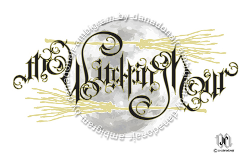
The ambigram above was both my debut piece and first foray to competitive ambigram making, bagged 2nd place I believe. Ooh, look at them lovely flourishes! Remember kids: do as I say, not as I do… hehehe
Layer.
For coupled words and phrases, layering them may be a more effective solution than having them on the same plane. Only be wary to not overlap or overcrowd where it’d be too busy to read. Sometimes this too work on single words where a ligature could overlay itself on top of the next glyph to act as part of the corresponding overturned letter. Choosing to do this, however, you may have to flex a lot more creative muscles than you’d normally use with mono-weight and monotone ambigrams but the reward could be very satisfying having made the ambigram more dynamic.
 Layering a medium “Bang” over a heavier “Big” and a couple of larger iterations somewhat created a gradually expanding radial motion suggesting an explosive origin of sort. And while “Bang” was on top, you are still prompted to say “Big Bang” because “Big” is more imposing (and probably familiarity with the phrase helps a lot too).
Approach it as you would any puzzle.
Not only is ambigram an optical illusion, it’s also a puzzle to be solved. And as you would with any puzzle, you first look at all the parts available to you and recognize which would act as the linchpin or the keystone or a cipher that could thread through or hold together or break the code to help you set things in motion. How do you do that? (Un)fortunately, through multiple failures.
ACTUAL TIP –> Make each glyph slightly elongated or taller.
The brain can recognize (most of the time) the top half of a letter at a glance. Familiarity will get you halfway through recognizing the word. Remember, we are hardwired to recognize and pick out patterns. Try covering the lower half part of the ambigram below, and see if you can make out the word.

By the way, this is the world premiere of this ambigram. And after a painstakingly long time debating with myself what to call it, I have finally decided to name this one “theory”. Its proximity to the Big Bang ambigram was purely coincidental.
Keep on sketching…
When developing a piece, explore every possibility. Try different combinations, letterforms and ambigram types. Sketch away… use the back of misprints and discarded reports from ten years ago… save a tree.
Keep a pen handy (better if with a notebook) wherever you go, you’ll never know when the muses shall visit you next. The idea for the piece below came to me while I was stuck in traffic with no pen and paper around and I had to consciously block everything else out until I got home, so I wouldn’t forget. You can check out the final ambigram by clicking >>> this link <<<.

While not necessary, learn a graphic design program.
You can create great ambigrams by hand, so you don’t actually have to. Computer programs just get things done a lot faster, not necessarily better. But wouldn’t it be nice to have that know-how in your arsenal, ready to be pulled out when needed? So if you do decide to try your hand on a software, invest on a vector based program.
Use an existing font… as a jump off platform.
While it’s easy and novel using a readily available font and work it to form an ambigram, more often than not the final product appears to be forced and awkward. Believe me, I used to edit fonts straight away. It’s a great exercise, I can attest to that, but there seem to be no pleasure (at least to me) gained from it. Now, I usually try and approximate the general characteristic of a certain font but still work the ambigram from scratch. The ambigrams below were based off Serpentine.

Take advantage of all the glyphs available.
You don’t stop with just the letters, no, you have at your disposal every numeral, symbol, punctuation and diacritical mark! Use them if necessary. Best example I can give you is my most favorite piece, PASKO! Take notice of the last two glyphs, the “O” and the “!”, as they were kerned tight enough to form the “P” when overturned. Of course, I had to adjust all the other letter spaces to even them out.
 Hey! It seems that while this piece has appeared in Nikita Prokhorov’s Ambigrams Revealed and other places, this is the first time it has graced this blog!
Ask for advice.
A lot of people have been doing this a lot longer than you’d imagined. And the people that I know who have and still are, are so generous with their feedback and advise. Look for and try going on forums or join a community. I belong to an FB group called Fellow Ambigrammists.
Check out other ambigrammists work, and wallow in sorrow with the realization that you’re too stupid to have not thought of or done that piece first! You’re never going to be as good as them! (That last line was a self-deprecating sarcasm, just in case it went whooosh! by you.) But really, you don’t have to be as good as anybody, you just have to find your voice, your style, your niche. So, learn from their work… digest… take inspiration from them… interact with them… ask questions… then incorporate whatever you’ve learned from all these with your next attempt.
Show your work and take a hit.
Not every “ambigram” you make will be appreciated the way you thought it’d be and get an A+ grade or raving reviews. Take note: just because you can “read” the ambigram doesn’t mean others will be able to. Sometimes the best comments you can get are those that ask “What does it say?” or “This so and so letter seems weak.” or “Can’t read it.” And that is just fine. What could come after that is an intelligent discourse on better approach to specific faults in the piece and all these new information will provide you new and different perspectives that’ll challenge you in to coming up with more creative ways to tackling the next iteration or an entirely new piece.
Much as it feels good to get a “like” when I post on the Fellow page, my actual intention is to get relevant feedback that could bring attention to possible flaws that I might have missed due to my own biases. I try as much not to prime the members with captions obviously to test the ambigram’s legibility. That is why I even put up Filipino ambigrams, or as I call them Suliktad, for the same reason.
If at first you don’t succeed…
Try the word out on a different ambigram type. Aside from the usual rotational, you could try it as a chain, reflective, perceptual shift or a symbiotogram. Yes, there are other types of ambigram you can exploit. Go for it, just remember each type operates on slightly different principles.
If that don’t work as well… do not be fixated on a single word/phrase/name.
Be open to the possibility that the word/phrase you are trying to create is a non-ambigram friendly word, maybe it’s just not doable. Find a more suitable synonym or another form of the word. There are plenty of words that I have been working on and have just recently cracked and there are even more that I haven’t. Or…
Just, Walk away… Renee…
When you’re at your wits end, walk away. Go read a book, binge watch The Night Of, listen to Tina Fey’s Bossypants audiobook, immerse yourself in the discography of MC Miker G and DJ Sven, climb a mountain, ford a stream, follow a rainbow, take up line dancing, do gardening, repair that leaky faucet you promised your wife you’d do or work on other materials and designs. Put it out of your mind. Then after a spell, come back to it with hopefully fresher eyes. You might realize that you are just being stubbornly myopic and looking for a solution to the wrong problem.
Forget everything I said…
After churning out designs after another based on your methodology, things start getting… familiar. And familiarity keeps you blind and numb to creeping faults in your system. You tend to be complacent and dependent on it because it works for you, you’re accustomed to it. So, once in a while, go against your gut. Move out of your comfort zone. This might or might not deliver a pleasant looking piece, but it’s beneficial either way in the sense that it’ll keep you in check, on your toes, and not rest on your laurels. Shake things up. Challenge yourself.
Enjoy.
Legibility.
If it is truly necessary for creating ambigrams to have a rule, even just one… then definitely, an ambigram needs to be legible. A really successful ambigram can be read easily even if you are not familiar with the word or its meaning.
***
There you have it, my ambigram making process. Winding it down, let me add this one “WHY” to the list. Why I do ambigrams.
The “Yes!” simultaneous with a fist pump moment.
Or simply put- the Eureka! or Aha! moment.
This is probably the biggest driving force for me, something that I thought was lacking in my attempts with other discipline and artform. I tried Visual Arts in my college days, it’s not for me. Experimented with photography and then video production, which I both enjoyed very much and still take on from time to time, but it wasn’t my calling.
Easily, over 75% of my ambigram solutions were followed immediately after with fist pump gestures. In fact, to me, ambigramming provide twice the gratification. First, this rush that happens midway through the process after having solved the puzzle. And second, as I contemplate on a finalized version of the ambigram. There’s this feeling of satisfaction and completeness I get after cracking the code and finding a solution to the problem at hand, and then looking at the final piece. Not better than sex – as nothing is, but relatively close.
And now we’ve come to a not-so-real-time account of me doing an ambigram.
First, apologies for the camera work. As you’d soon find out it’s not easy shooting yourself (with a phone) as you draw. The camera tends to wander off the subject as I zoned in on sketching, and at times the pencil would just hover about as I shift my focus on the phone to see if I have it all still in frame. Also, there was supposed to be an annotative track over the video but the recording was awful and I sounded nervous so I took it out. Maybe on my next attempt. The video was sped up enough so we can still follow the process without getting a headache because at normal speed it seemed to be just dragging on. Am sure no academy award will find its way to my mantle with this stuff.
The Oprah moment we’ve all been waiting for… Freebie!!!
Finally as promised here is the >>> link to my cheat sheet <<<. Enjoy!
Hmm… nice way to celebrate my 50th post, 4th year with WordPress and end 2016 with. Hopefully you could all check back in for issues 51 and 52 for an ambitious multi-layered rotational and chain combo suliktad and journey back to the Ambiverse. Maraming Salamat, po!!!
fate and destiny or destiny and fate
#suliktad #ambigram #danadonajr #imagefoundry


It’s nearly Halloween! And so, this month’s brew is laced thick with Filipino-style mysticism.
Twice a year, in my largely superstitious country of origin, these topics resurface like clockwork – around Lent (especially Holy Friday) and All Saints/All Souls Day. So in keeping with tradition I have conjured these two suliktads (ambigrams)… Tadhana and Kapalaran. Both words are interchangeable translations for Destiny and Fate. Kapalaran tends to be more positive of the two and could be a surrogate for Luck but we use the Spanish lent “Suwerte” more often in the vernacular.
As I am so fascinated with Filipino Mythology, folklore and brand of occult, that I have once again chosen to go that route… although leaning a bit towards our Spanish influenced aesthetics. The first image (Tadhana) was actually intentionally posted upside-down with a clearer general image coming to fro once turned right side up. It incorporates the ancient Tagalog script Baybayin in place of western runes as casted spell. The third image draws inspiration from a scene from the third act of the Constantine movie.
In both cases the suliktads were drawn based on Blackletters. Other letterforms were explored, and while I was consciously hoping for a good serif type turn out for the Kapalaran chain, I saw that going Blackletter would serve these designs better.
I would have produced more skin art related images but other obligations that require greater attention had me setting them aside… til next time maybe.
aking kulay, aking lahi
#suliktad #danadonajr #imagefoundry


Could not really find time to write a full essay for this suliktad as I had been busy with my workload for the past weeks. And the coming weeks will prove to be just as crammed (although I have a full week of Eid Al Adha vacation) as I fortunately landed a couple of design jobs that’ll need my full attention.
I made two ambigram versions of the word KAYUMANGGI. While fairly similar in construction, the first one is sort of a script/brush type rendering of the ambigram and the second iteration is more of a serif type. These two, however, are recent versions- a remake if you will… after a thoughtful “autocritique” on the merits of the earlier version’s form.
Kayumanggi is a word that both refer to the Malay skin tone and to the Filipino as a race. However, the use of the Spanish moreno in the vernacular in reference to our skin color elevated the word kayumanggi to a regal descriptive word for the Filipino ethnicity.
So, I proudly celebrate the Filipino (with its faults, flaws, misgivings and imperfections) with the suliktad, Kayumanggi.
st. elmo’s fire!
 Take me where my future’s lyin’…
I’m just going to come out and say that although it was not the song – nor the movie – that inspired me to create this ambigram, it, however, kept on playing non-stop in my mind all the while I was in the process. And I will bet John Parr’s voice is taking up space inside your head and between your ears right now as you read these first few lines.
I don’t blame you.

From a monotype sketch comes this fully digital vector. And while I was adamant on anchoring the chain on the “S” I was pleasantly surprised at how the dot on the “St.” abbreviation flipped over to be an apostrophe. As a whole my only concern with this is if the overturned “t” will be too much of an eyesore as it basically has nothing to do there but hang. But really looking at it (especially the full chain version) I thought it did not stick out too much like a sore thumb as I really had to look for that over turned glyph. And I thought to myself that if I even had to look for it, then it probably would not take much away from the whole picture.


I don’t really have much of an essay to write here as this is one of those spur of the moment ideas… I suddenly thought of it (a couple of months back) and somehow managed to finalize the artwork in about two days. Unlike my other ambigrams that I could go on with stories of wracking my brain to find a solution and finding little time to vectorize it- I am happy with this one, this was essentially an easy one for me.
Unfortunately though I could not think of a less obvious title for this post.
I can see the new horizon underneath the blazin’ sky
I’ll be where the eagle’s flying higher and higher...
my portfolio

FanFic, anyone?

Chapter 52, page 624
