
salt of the earth
Having been fortunate enough to work between 1994-2007 for the grand-pappy of labels in the Philippine recording industry, I had the privilege, in 2003, to collaborate with two of my musical heroes in time to commemorate over two decades of unparalleled contribution to OPM, Lolit and Pendong (sans Mike and Saro) of Asin.

Growing up with a musician parent has opened me up to appreciate a grand spectra of music genre, ‘though I feel that even without my father’s influence I would have gravitated onto some great music by myself. (He’s more of a standards kind-of-guy, but would later in his career sometimes crank it up a notch by taking on a few pop music in his repertoire.) As a “totoy” then a“Bagets” in the mid-70’s and through the 80’s, I was swept for a ride with the emergence of what is essentially the foundation of Original Pilipino Music (a distinct category in Filipino music separating it from the indigenous, the standards, the foreign covers and Kundimans): the Manila Sound, the Manila Pop(ular) Music, Pinoy Rock, Pinoy Novelty and Pinoy Folk- to which Asin’smusic is categorized. As (probably) with most of my peers, my introduction to the music of Asin was via a bootlegged cassette tape… and the 70’s and 80’s saw the proliferation of bootlegged everything in Manila, especially mixtapes. Along with their contemporaries, Asin’s music was teeming with social commentaries. Interestingly enough, the music they brought forth significantly plays more than just as background score to the most tumultuous part of the country’s contemporary history. Their music became staples in the cries for sociopolitical change at that time and for the years following. While classic OPM ruled the airwaves at that time, the early 80’s through the early 90’s saw its decline when MTV crashed the party, the Manila Sound, Pinoy Rock and Pinoy Folk has been relegated to weekend radio playlist up until a renaissance of sort took its place back mid-90’s.
Fast-forward to 2003 at Vicor Music, Lolit and Pendong had just signed a contract for an anniversary record release. Armed with my Nokia 3210 (yyyyup!), I got Lolit’s mobile number and forwarded her my bespoked ringtone “Cotabato” based on Ang Bayan kong Sinilangan. And because my boss’s office was about three meters away from mine I heard Lolit play the familiar 8-bit tune, followed by a short shriek and a roomful of chuckles. I was outed by my boss’s executive secretary (who btw gave me Lolit’s number) and was ushered in to be introduced as the guy to handle the album cover design and packaging. Pendong and his wife Chat just as soon, asked to be sent the same ringtone. (Whew!) Lolit later revealed that she shrieked because she was just talking about the song and Saro (their departed original vocalist) moments prior and thought it was a haunting!
The pictorial for the inlay, press and marketing releases was another first for me, as I had in collaboration, top caliber and veteran cinematographer Charlie Peralta behind the lens at Roper’s putting in to film what I had only a few days back sketched out. We would later on work on a couple more projects.
The Ambigram
Creating the ambigram brought back a lot of great memories… working with the band, and of my 13 year gig at Vicor and even further back when I was younger. At times humming and/or bellowing out lyrics while bobbing my head with the full playlist in my head as I finalize the ambigram, making it a fun couple of days.
Although I almost hardheadedly kept on working on an S/I flip which had me going for a couple of sketches, a fairly easier and more pleasant solution was to, apparently, extend one of the “A’s” leg as a “tail” which would serve as the “N’s” back leg when flipped… making the “S” a perfect pivot. Stretch out each character a bit and ease out the tail to even up the spaces between the “I” and “N” when overturned. Since there were just two glyph to contend with, it was a fairly quick vector process than usual.


Based on the initial sketched design a vector file was created and then tweaked a few different ways. With the ambigram finished to my liking, I thought to myself that it would have been great had I known ambigram 15 or so years ago and have this piece (or a similar version) incorporated with the Baybayinscript on the cover I had done. But no… the Asin logo* holds way more coolness points with its history than this newfangled fan creation. Maybe on a future tribute album release or something… and after this maybe I’ll try a few more with other OPM legends.
#suliktad #danadonajr #imagefoundry
* The more commonly recognized Asin logo is actually it’s second logo. Earlier albums carried a stylized logo with the letters drawn as individual (salt) crystals.
stopandgo
Hello, it’s been a while, so let’s get down with it!

I did this design a couple of months back but i kept pushing back its posting for other ambigrams. If you have not yet figured it out, it is supposed to read “Stop & Go”. A logo for a fictional neighborhood convenience store. While it bear characteristics of a perceptual shift ambigram, that was never my intent… it just kind of happened. (It seems like almost anything I do now, is ambigram influenced!) And because the logo was not set the way a perceptual shift amb traditionally is made or presented… I do have reservations in calling it as such. I’ll just let it stand as it is.
So, how did this started out? Well, the idea came while I was, stuck in traffic on a bus, on my way home. Looking out at the series of convenience stores and customers coming and going, got me thirsty. As I cannot board off just yet, I just trained my eyes on the flashing yellow signal light a few feet above where I sat. The actual image in my head was similar enough with the graphic on top. So, when I got home I took out a couple of scratch paper and let it all flow out! (Do not mind the words printed on the paper… it’s for my daughter not mine!)
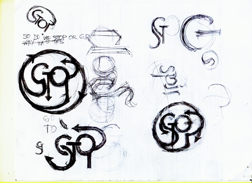

Then came, the vector work….

Then off to Photoshop for image editing.
Now, while working on this post, I just realized something that I never considered before. WordPress lets you import animated gifs! Yup! As you may have guessed, the image on top is an animated gif based on the final jpeg image that came after the vector work. While I do most of my animation in Flash, most sites don’t support these files as well, it’s going to be so much easier and so much fun to present some of my ambigrams this way. So we’ll see how useful saving in gif would be in future posts.
almost!
I have had a few chances of having my ambigrams in the real world, and these two are a couple of “couldabeens”.


The logo is supposed to represent a record (music) label with “biker-theme” elements as the label is an “offspring” of a biker-themed watering hole here in Manila of the same name.
But as fate would have it, the guys chose a different design. Ugh (probably not into ambigrams). But that is not the troublesome part.
They were pretty much decided on the “look” of the logo, so no biggie. The ambigrams were just add-on bonus designs, if you will. You know, just in case.
The vector file I created the logos with, however, is dead. (I had to re-do the selected/approved logo design.) All I have left of these (as of now) are two med-res .jpgs and a couple of good .epses (whew!).
So how did the file die? I think I may have “over-populated” the file before I got the chance to distribute each design to individual files (there were about 8 designs, not counting the varying subtle changes created along the process). I tried looking for the usual backup file but alas! None. These things rarely happen, but they do happen. So chalk another one up for experience…
Nothing left to do but… recreate. Or let it go…
And speaking of recreate… the updated thewitchinghour.
To those who were able to catch the suggestion/comment in Fellow Ambigrammists of our esteemed John Langdon a while back regarding this design’s previous incarnation (see design), well, here you go. Again a big, big thank you again to Mr. Langdon. (Why didn’t I see that before?)
. . . . . . . . . . . . . . . . . . . . . . . . . . . . . . . . . . . . . . . . . . . . . . . .
+ a stab +

Before I go for another round next week, here is a final “almost”. The Committee on Public Information’s Freedom of Information Bill hearing in the H.O.Representatives has been adjourned for November 27. It seems to be a downhill course, session break is near. The Senate has passed its version much earlier, so who knows really, the HOR may just be holding out for a grand…. nah, that’s just me seeing the glass half full.
I decided to use clear and simple font styles here. Keeping it “simple” gets the message across faster, much like what a bill like this could do as a law for common people seeking transparent governance.
Be safe, ’til next week.
my portfolio

FanFic, anyone?

Chapter 52, page 624
